To give this some clarity, bad UI is not just annoying. It is expensive, confusing, and strangely confident for something that clearly has no idea what it's doing.
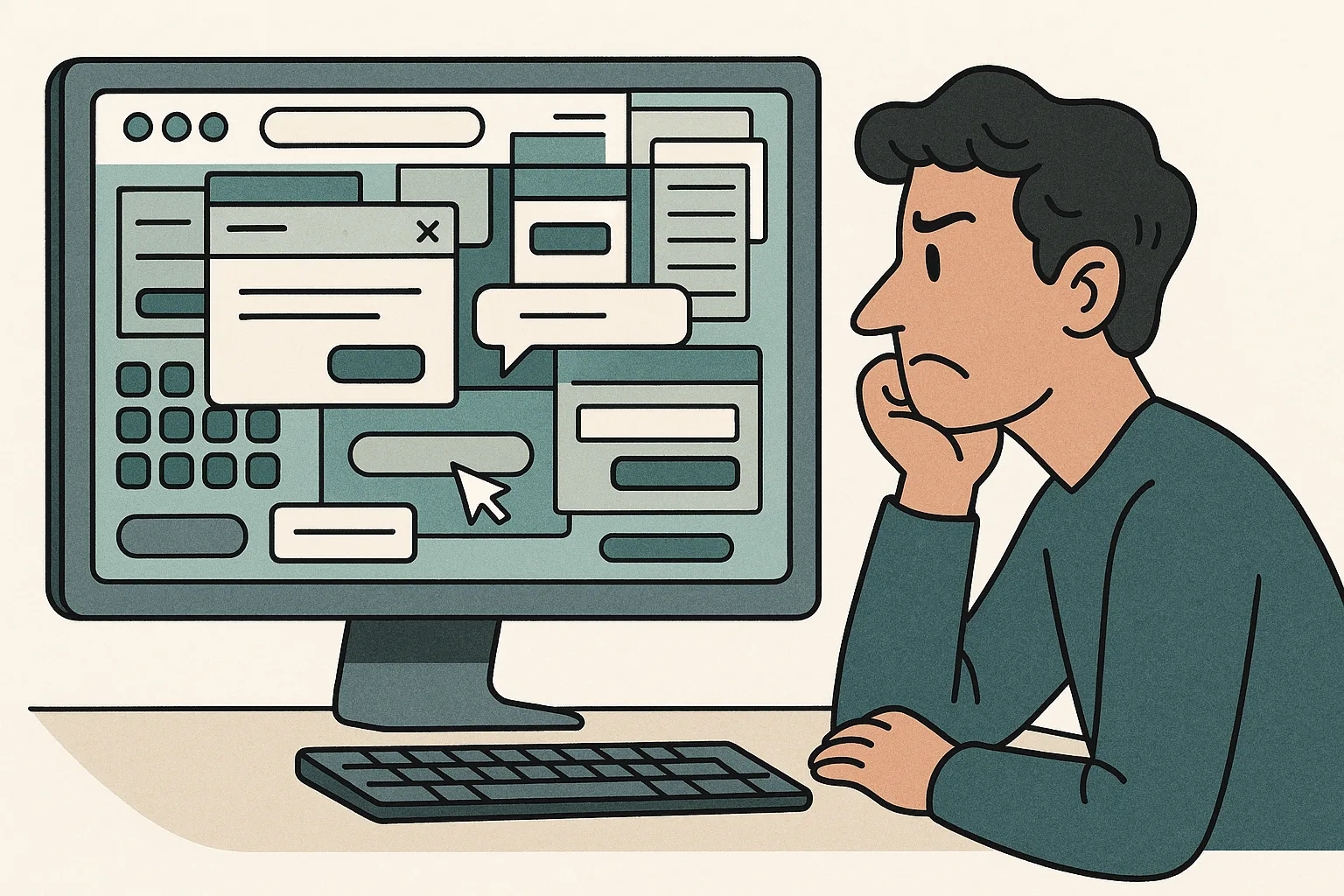
A good interface helps people succeed without making them feel like they need to "unlock" the software with a side quest and a torch. A bad one, on the other hand, hides basic actions, labels things vaguely, and then acts surprised when users click the wrong button. That is not innovation. That is digital mischief.
From my perspective, the best user interfaces feel almost invisible. They guide people naturally. They make the next step obvious. They reduce friction. They do not make a person stare at the screen like it just asked them to solve a riddle from an irritated wizard.
This is where people get tripped up: designers and product teams sometimes build for familiarity with the product instead of clarity for the user. Those are not the same thing. Just because the team knows that the tiny floating icon opens billing settings does not mean a normal human being will know that. And often the root cause is the hidden cost of adding one more feature without protecting simplicity. In fact, a normal human being may assume it launches a chatbot, a coupon drawer, or a cry for help.
Good UI is kind. It respects attention. It says, "You're busy, let me help." Bad UI says, "You'll figure it out," which is a bold strategy for software people are paying for monthly. If you want a better metaphor for building things with care, consider how baking bread can teach you about software design.
Make tech easy. The interface should be smart. The user should not have to prove they are.
Be the first to share your thoughts.