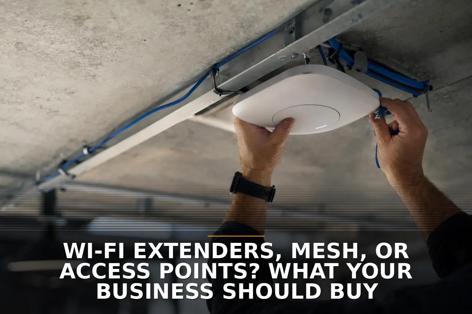
Wi-Fi extenders, mesh, or access points? What your business should buy
Wired access points are the right buy for most businesses, mesh is the fallback, and extenders are rarely the answer. This straight-talk guide helps business owners choose the right Wi-Fi fix for dead zones, shops, offices, and multi-building properties.

How to Test Your Website Contact Form to Make Sure It Works
The right way to test your website contact form is to submit it like a real customer, then verify delivery, inbox routing, and any CRM handoff. This step-by-step guide shows small-business owners how to catch silent form failures before they cost leads.
WordPress or a Custom Website? Cost Ranges and the Better Fit
**WordPress usually costs about $1,000 to $8,000, while a custom website often starts around $5,000 and runs $10,000 to $30,000+.** This breakdown explains which option fits a small business better, where cheap gets expensive, and the ongoing costs owners forget.
Get posts like these in your inbox
Join the early readers of Thought Box. No spam, unsubscribe anytime.
What Local Businesses in NW Arkansas Pay for Website Maintenance
Most NW Arkansas businesses pay about $75 to $500 per month for website maintenance, with complex or high-priority sites running $1,000+ monthly. This breakdown explains what each tier includes, what drives the cost, and where cheap plans get expensive.
What Cheap Developer Quotes Usually Leave Out on Custom Software Projects
Most cheap custom software quotes are low because they leave out discovery, testing, security, deployment, and support. Business owners should expect roughly $15,000 to $80,000+ for business-ready custom software and compare what’s included, not just the headline number.
What It Costs to Fix Dead Wi-Fi Zones in a Commercial Building
Fixing dead Wi-Fi zones in a commercial building usually costs $1,500 to $15,000+, with most businesses landing around $3,000 to $8,000. This breakdown explains what drives the price, where cheap fixes backfire, and which ongoing costs owners forget.
Get posts like these in your inbox
Join the early readers of Thought Box. No spam, unsubscribe anytime.
Shared Internet Across Buildings: Wireless Bridge or Second Service Line?
If both buildings can clearly see each other, a wireless bridge is usually the better buy; if you need true independence or can’t mount equipment reliably, get a second service line. This guide helps business owners choose based on sight lines, network needs, downtime risk, and property constraints.
QuickBooks Add-Ons or Custom Software? What Small Businesses Should Choose
Start with QuickBooks add-ons and process cleanup, not a full custom build. Small business owners should keep core accounting off-the-shelf and use custom software only when workflows, integrations, or reporting are breaking around the edges.
Hire a Local Developer or Keep Using Workarounds? A Guide for Ozarks Businesses
Most Ozarks businesses should stop relying on daily workarounds and hire local project-based software help before jumping to a full-time developer. This guide shows when to keep patching, when to automate, and when custom software is worth it.